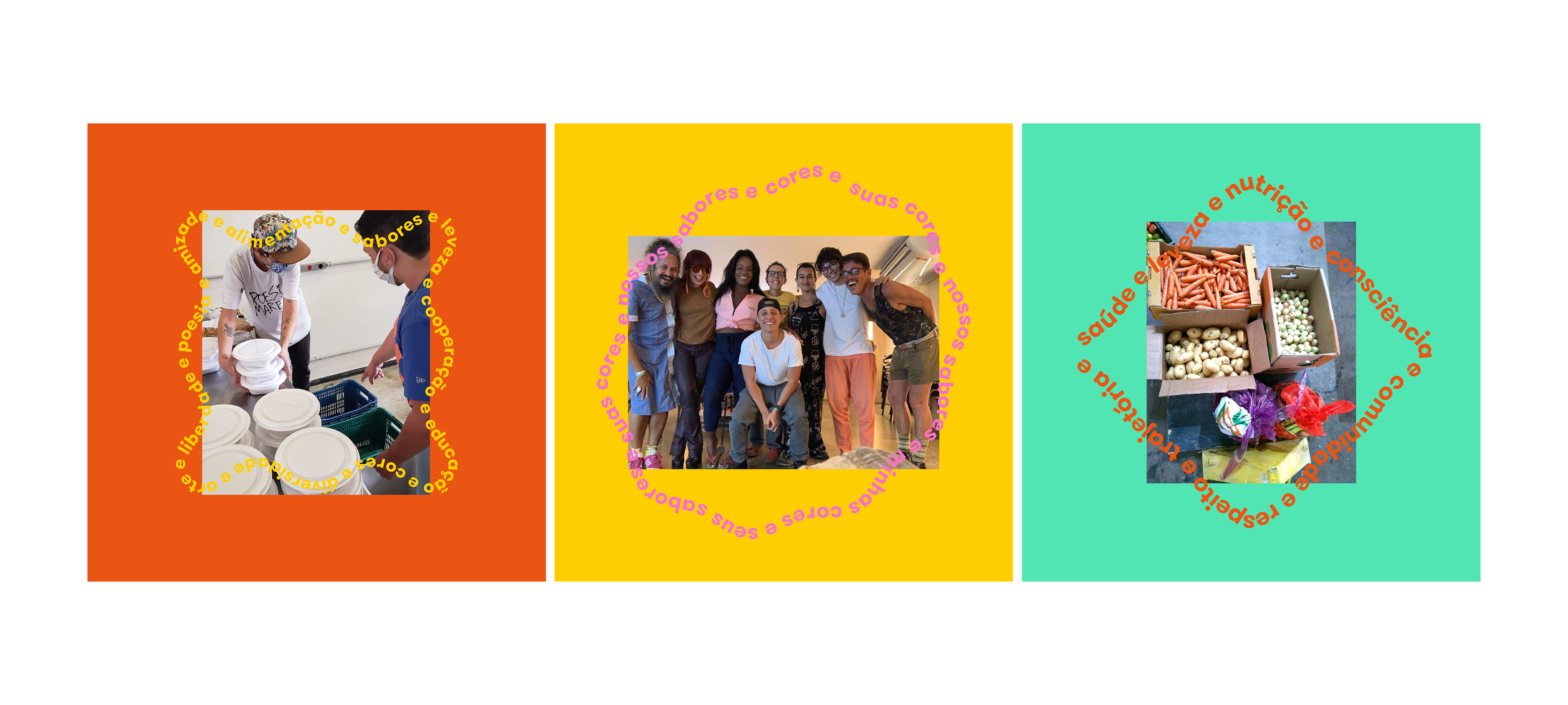
Cores e Sabores is a project that started in 2020, when the Pandemic first affected Brazil and its economy, as well as many jobs. In the first year, I was invited to work with them (pro-bono) creating graphic design for social media, so the project could get more support from companies with donations and then distribute food and hygiene products to people in need.
However, by the end of 2020, C&S became something bigger, and it needed a new visual identity so it could be visually detached from the buffet service that first provided the food and production (Manje Eco).
Carolina Milagres then invited me again to work on a new visual identity.
However, by the end of 2020, C&S became something bigger, and it needed a new visual identity so it could be visually detached from the buffet service that first provided the food and production (Manje Eco).
Carolina Milagres then invited me again to work on a new visual identity.
BRIEF
Develop a new visual identity for a social project, aiming for diversity, the goal of education and the craft of a project that has many hands involved. Create designs with a well-explained storyline and good visuals to make donations easy, but also be seen as a reliable group of people.
SOLUTION
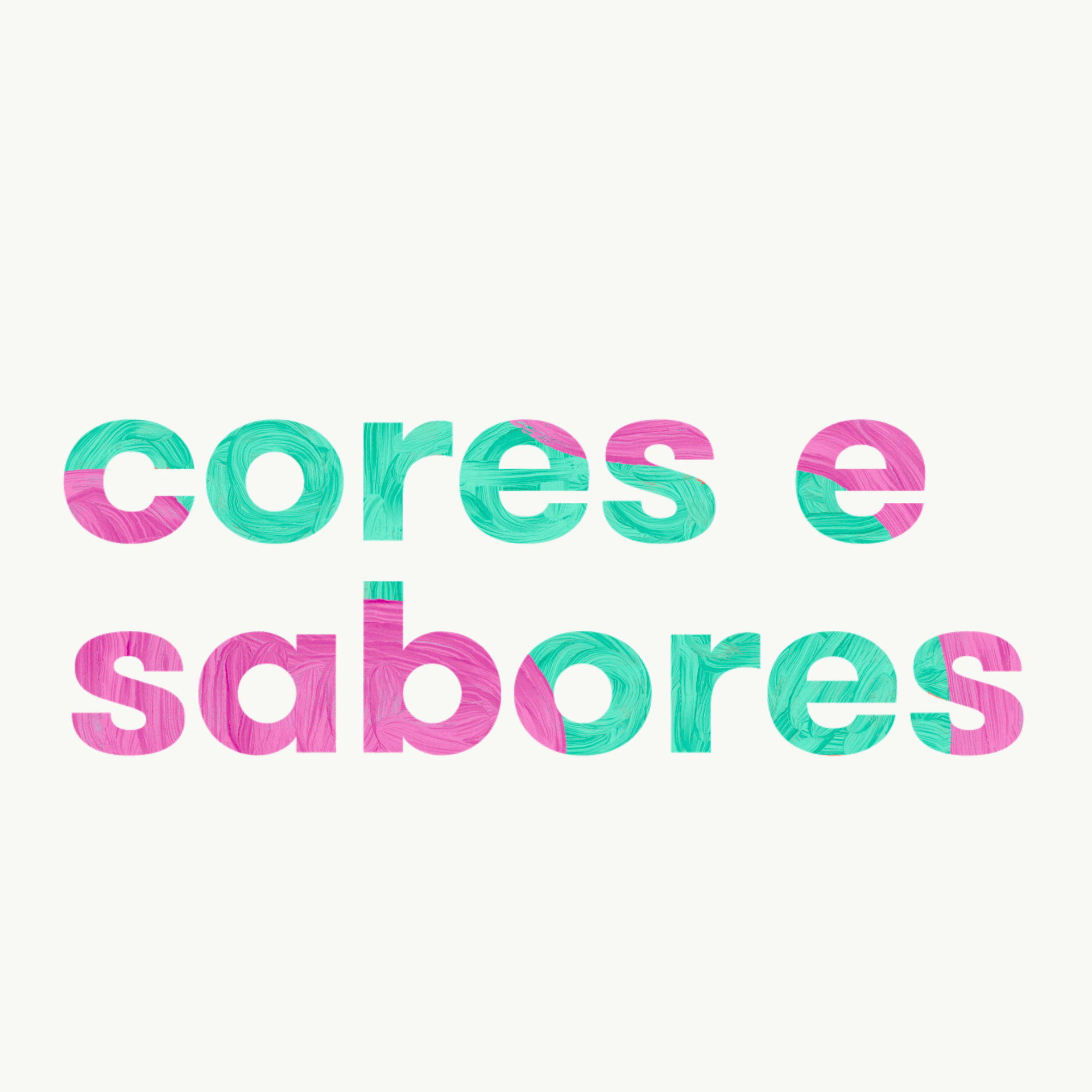
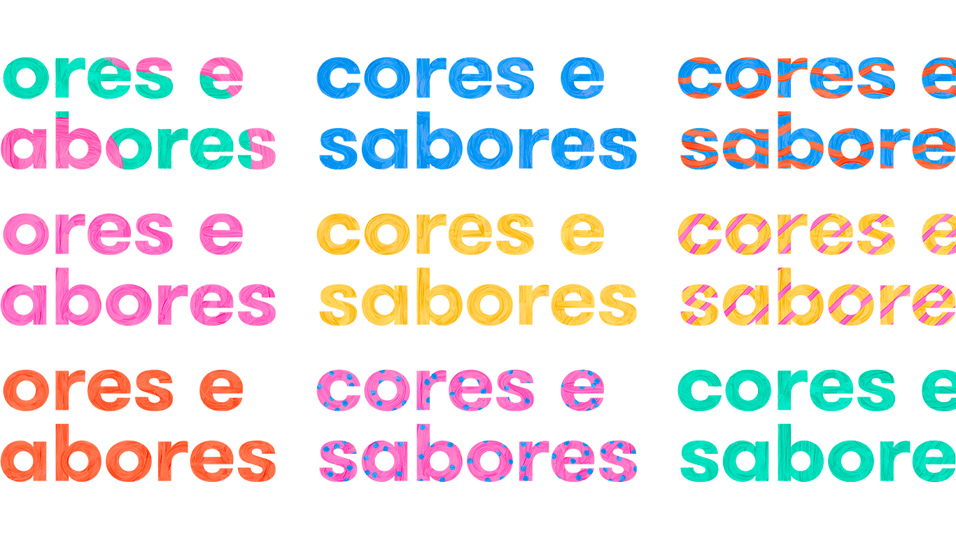
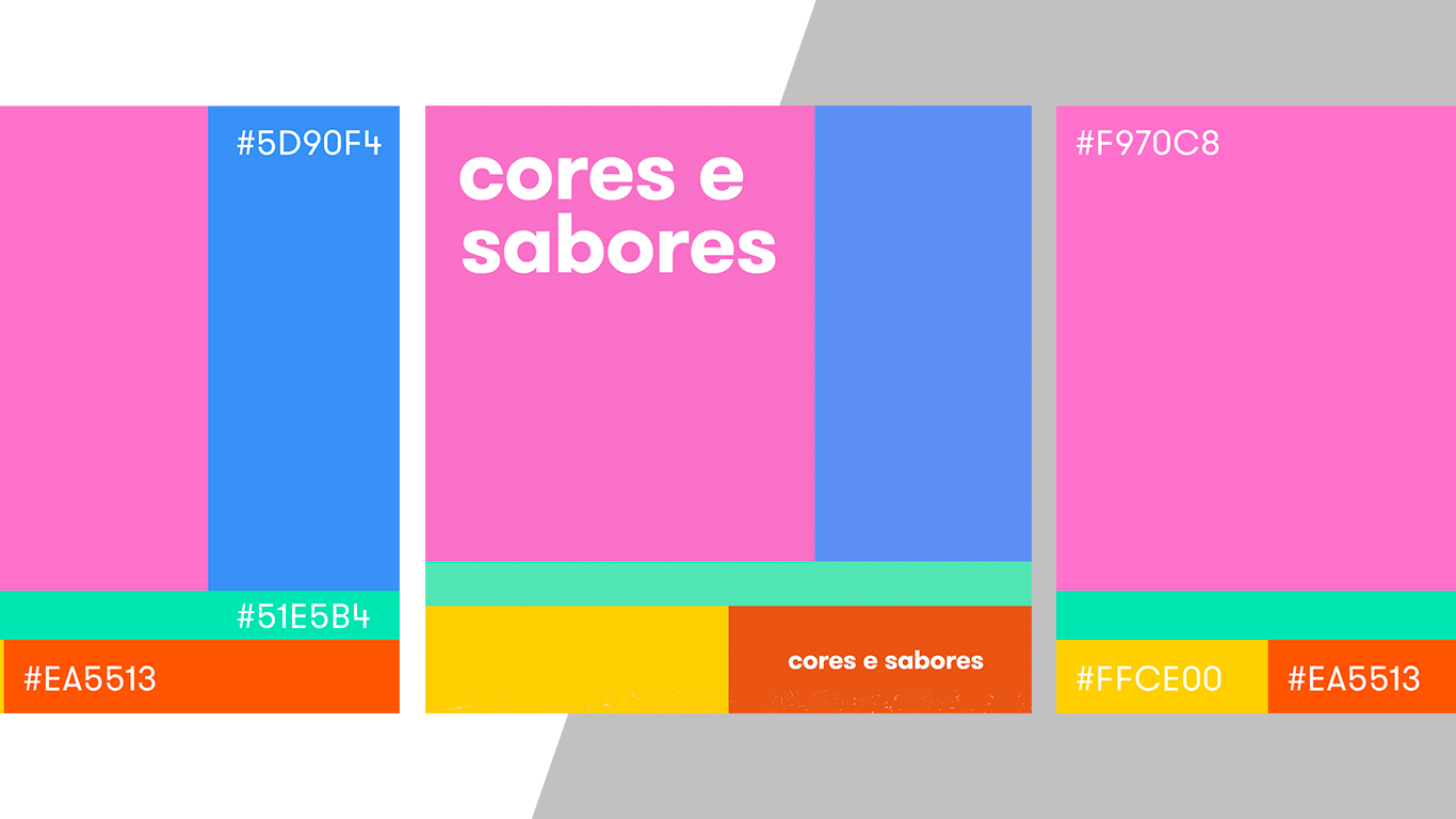
I created many versions at first, trying to explore specific symbols that could be read as universal and diverse. The challenge here was to be simple and reach as many people and businesses as possible. Then we had to simplify it, several times, reducing it to a logotype, but playing with colours and textures. The colours were used in a way to embed the word "cores". The textures were additional versions, to explore the craft of something built by many hands.
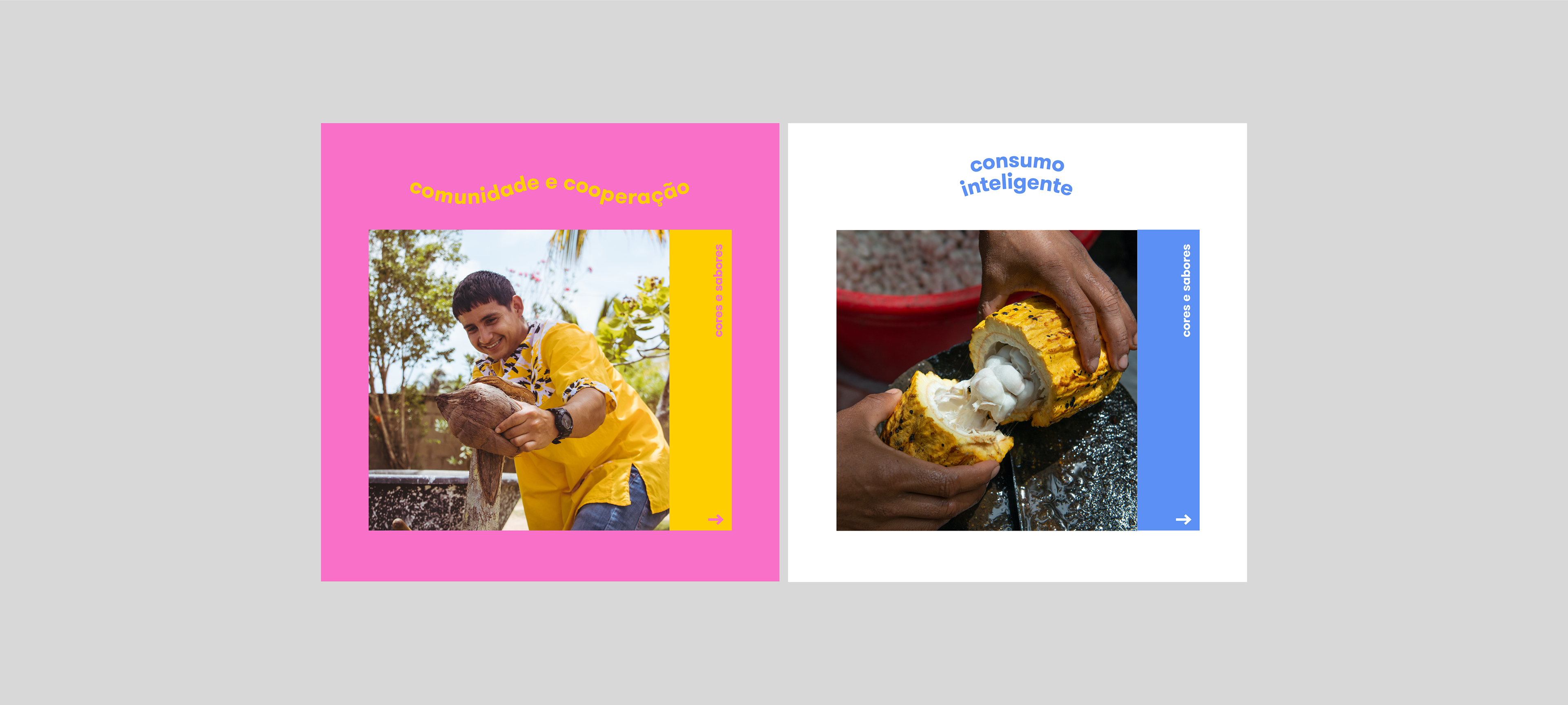
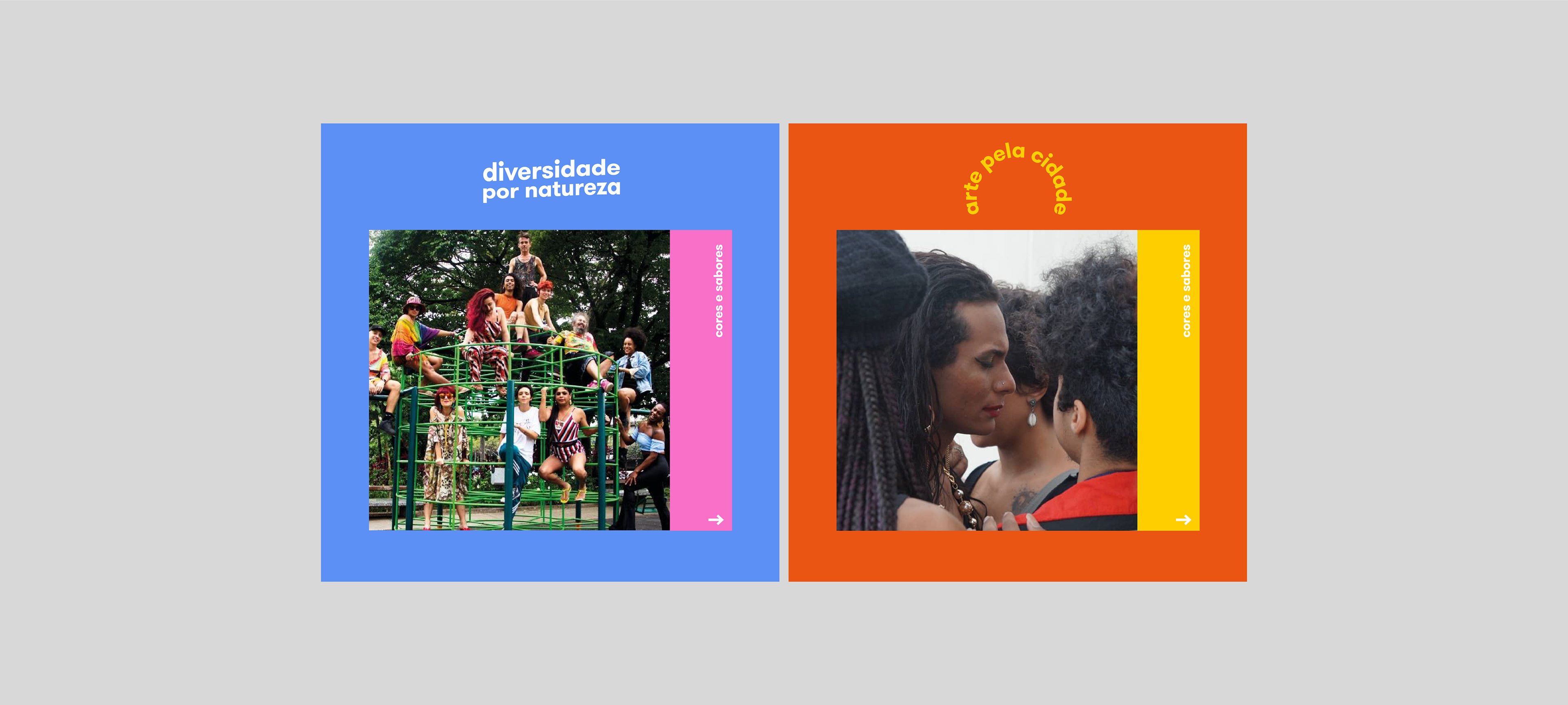
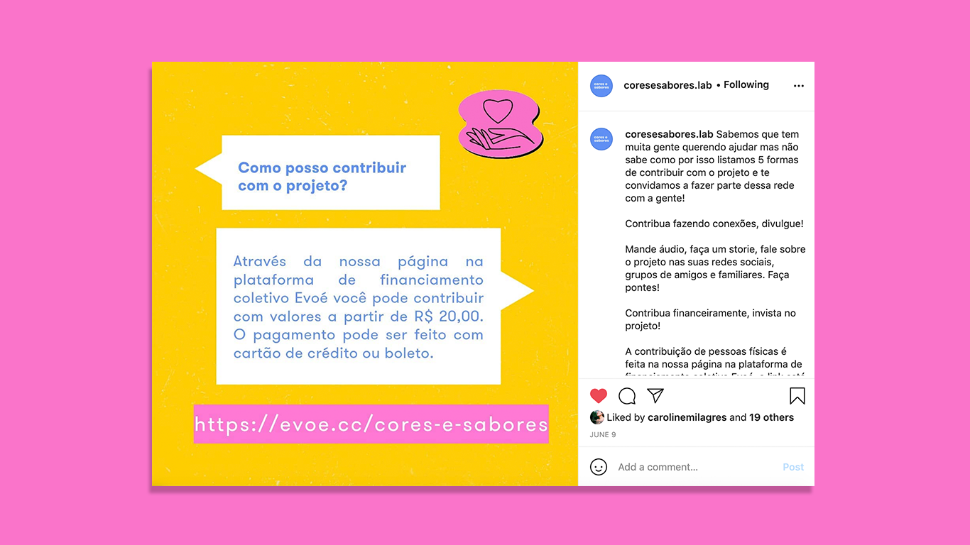
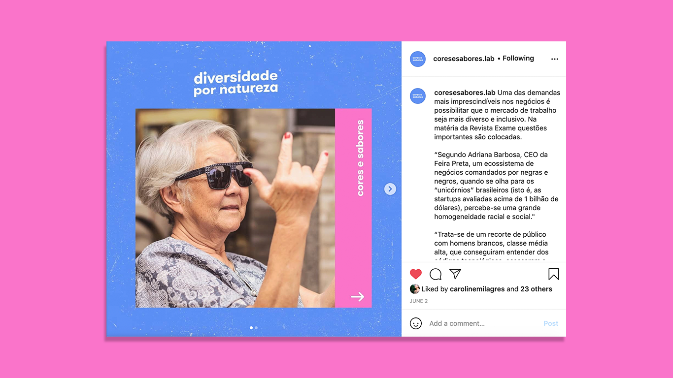
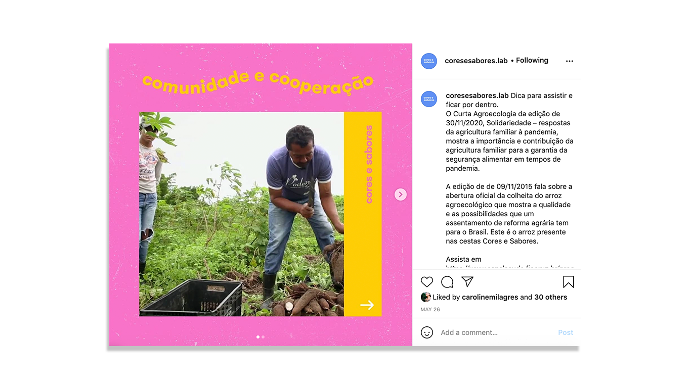
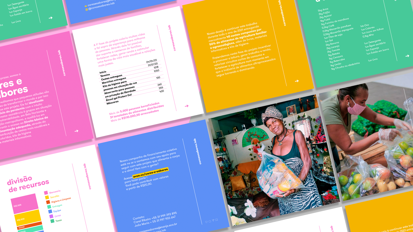
The design for each story on Instagram would explain why the campaign exists and who is organizing and volunteering. Then, the stories tell how to donate or contribute to the project. After it shows who are the people behind the campaign. Some are LGBTQIA groups, students, local business owners and drivers. Lastly, we are showing how the food is being delivered, posting pictures we were allowed to post, and sharing some thoughts people sent us.
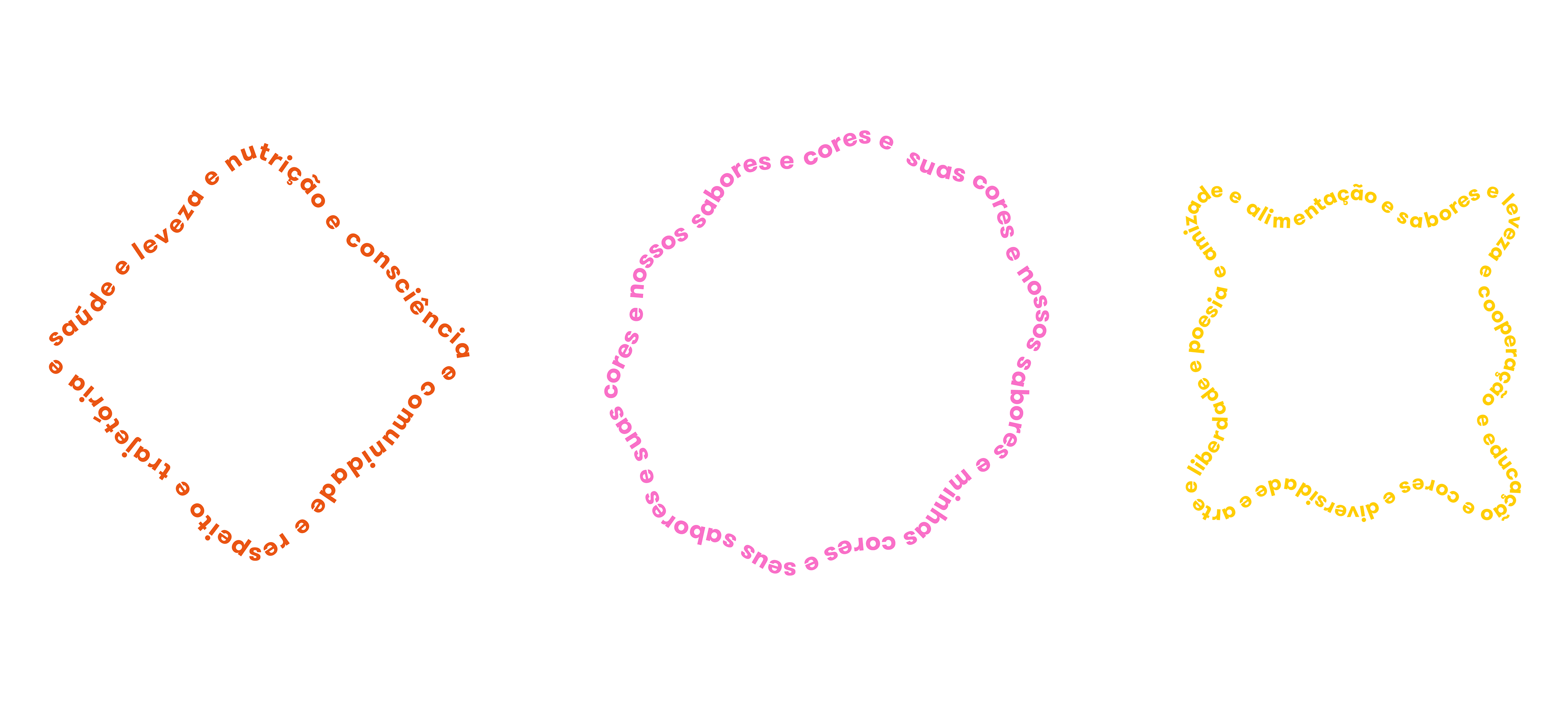
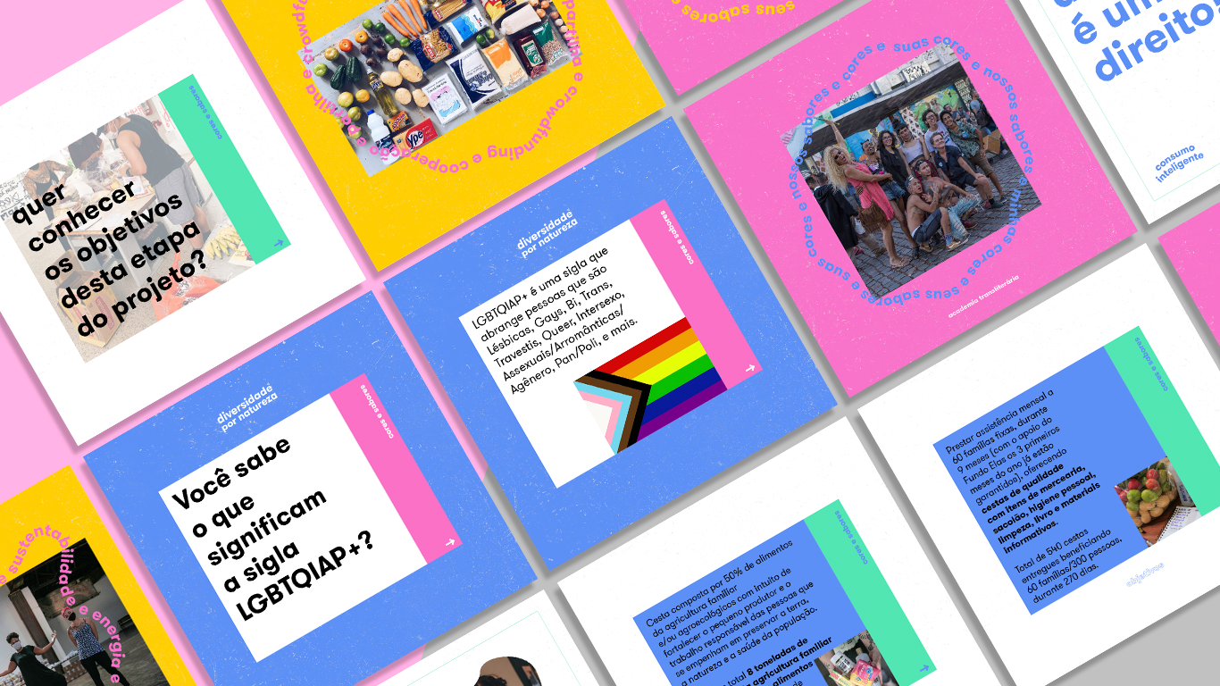
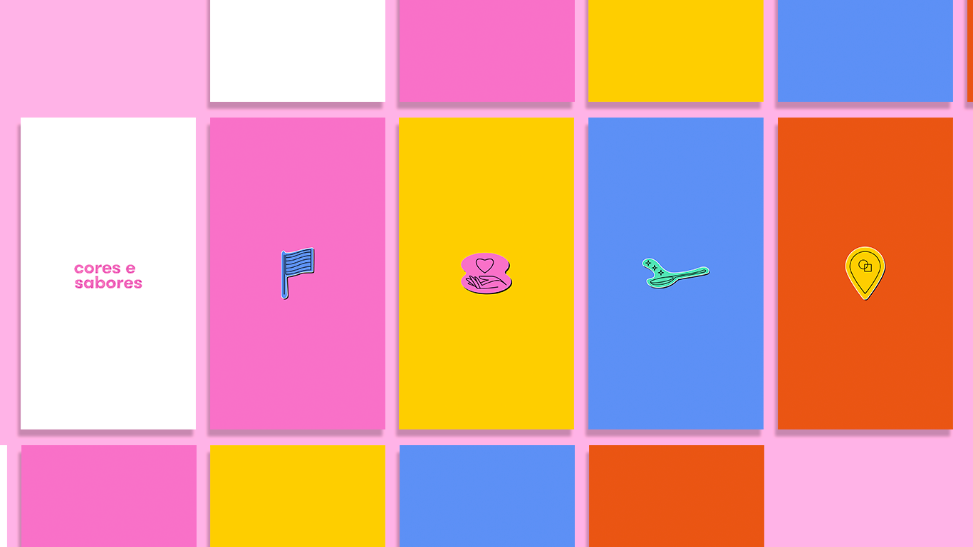
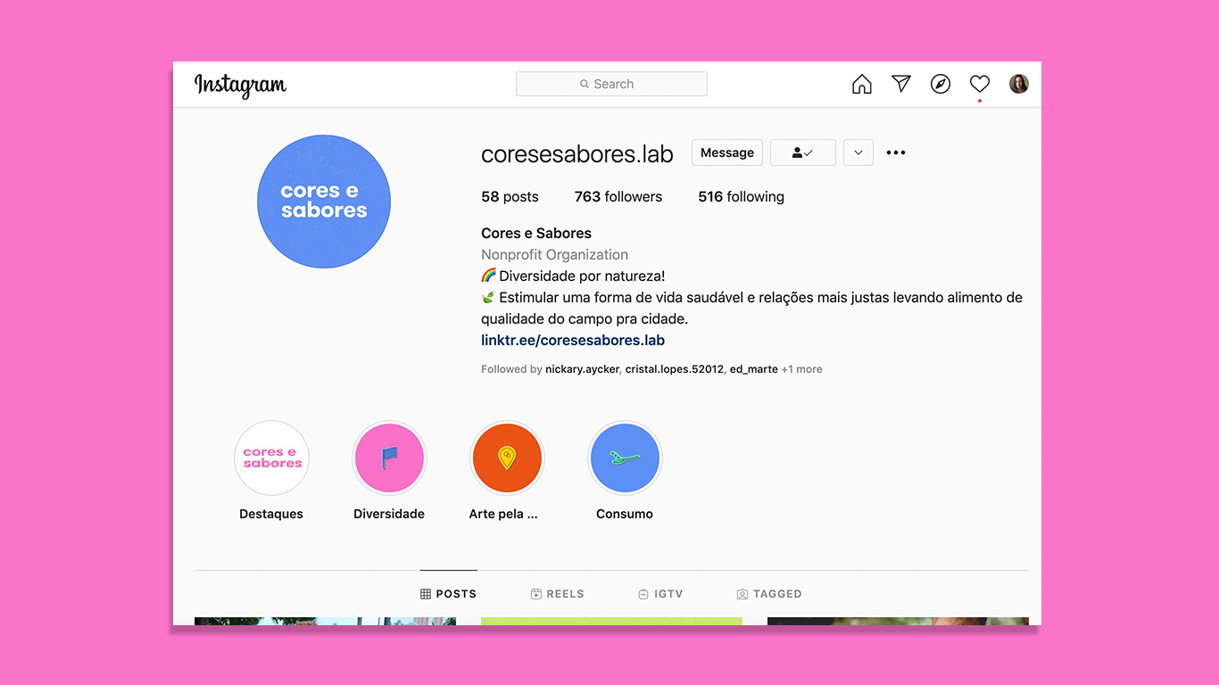
Highlighs for Instagram Stories - Each icon represents one category: Diverse by Nature, Community, Clever Consume, Art around the City
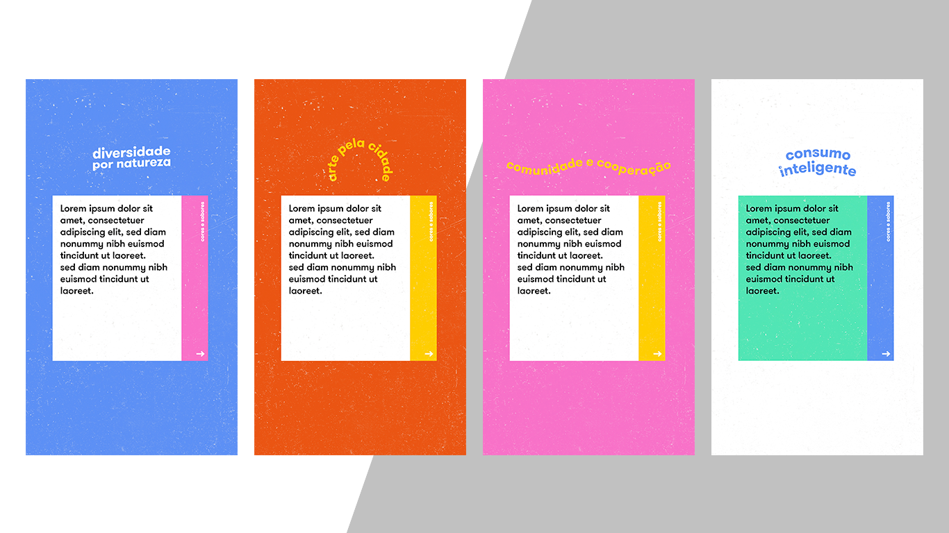
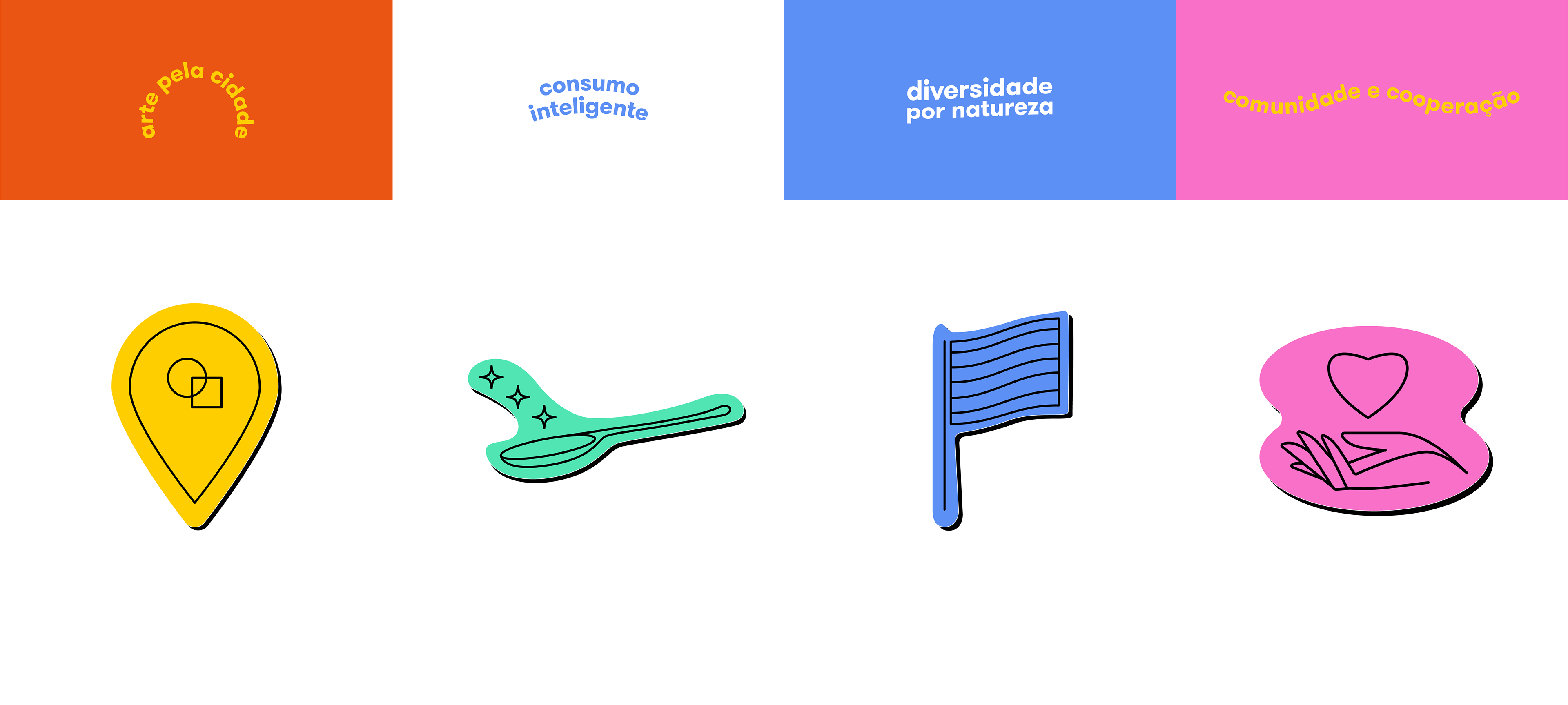
Each icon represents one category: Diverse by Nature, Community, Clever Consume, Art Around the City
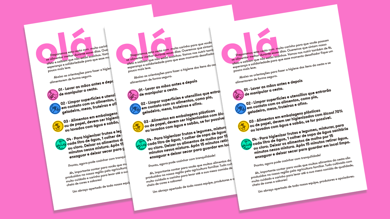
Inside each food bag, we left a leaflet guiding the user about how to wash their hands and the food they were receiving.